Case · Brand · 2021

Afrôdiz

Visual identity, print materials, and packaging for Afrôdiz, a natural cosmetics brand made with sustainably sourced, Afro-centered ingredients.

Client
Afrôdiz
Role
Lead designer · Drapo Studio
Year
2021
Deliverables
Visual identity, print materials, and packaging
Problem

A natural cosmetics brand wanted to be a reference for healthy-living knowledge, with a warm, welcoming image.

Solution

Lettering with details that suggest care and welcome, and a flower symbol that brings together nature, purity, and scent.

Delivery

Visual identity, print materials, and packaging delivered.

01

Context

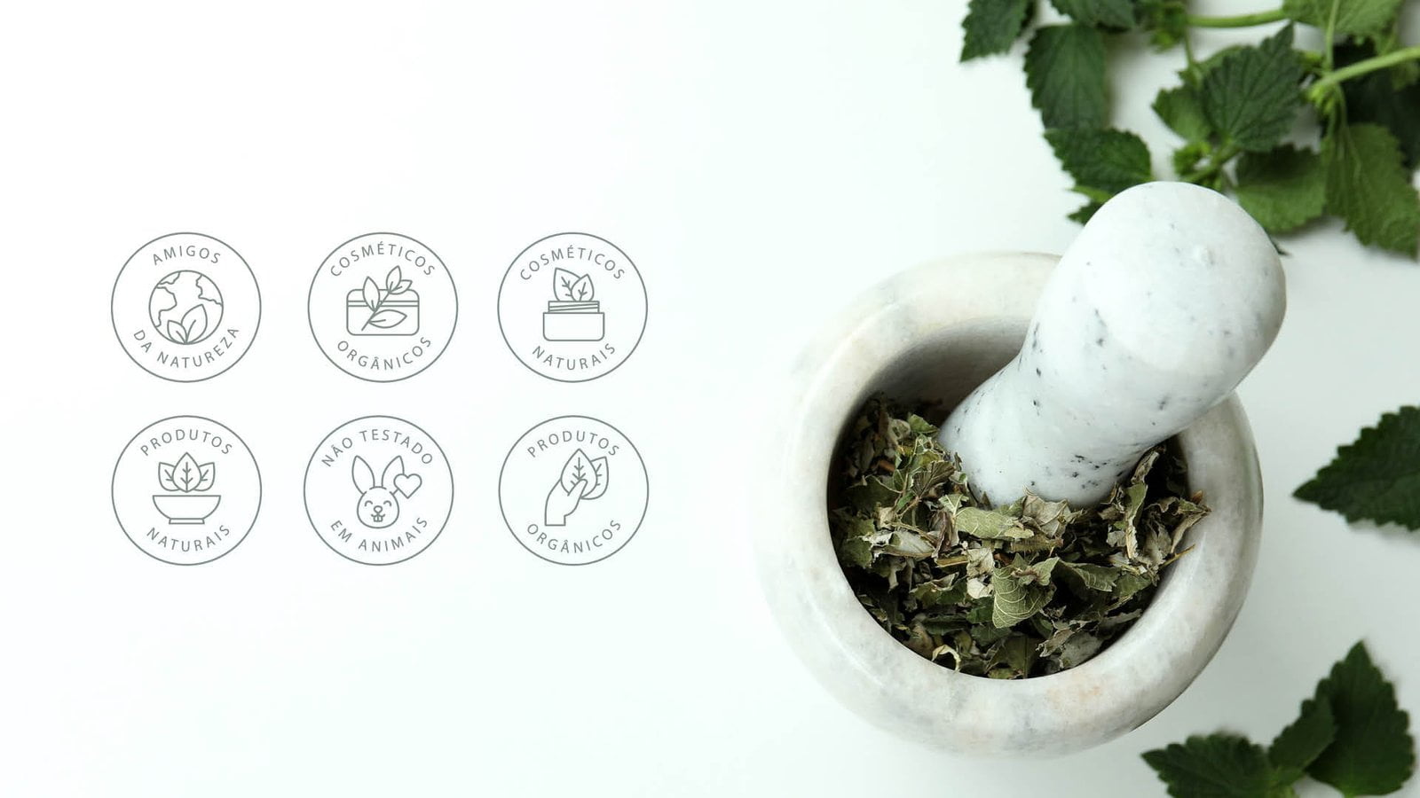
Afrôdiz promotes self-care through conscious use of cosmetics.

The products use natural ingredients, sourced sustainably and from Afro-centered supply chains. The brand wants to be a reference for the knowledge behind a healthy, balanced life.

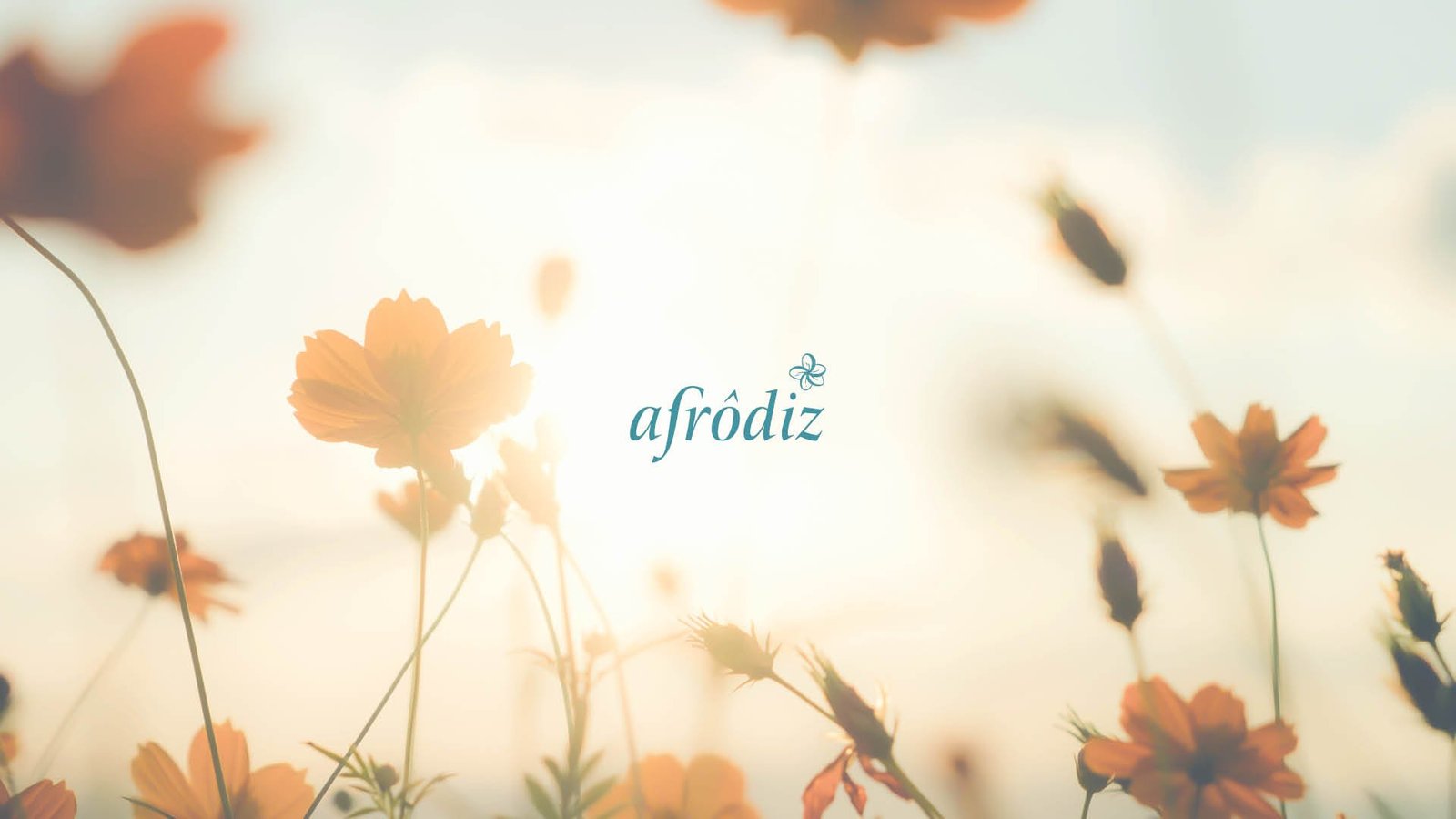
Logo over a field of flowers

A brand with the wisdom of someone who takes care of others.

02

Concept

The brand takes on the image of an older Black, Afro-Brazilian woman, wise and welcoming.

The lettering carries that wisdom and experience, with details in the letters that suggest welcome and care.

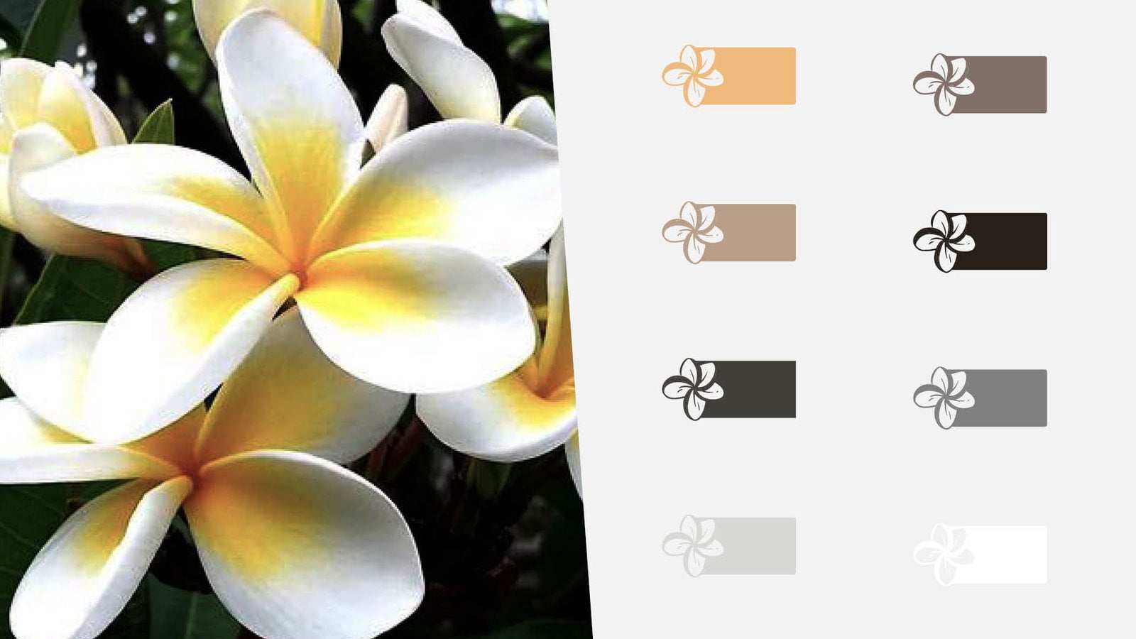
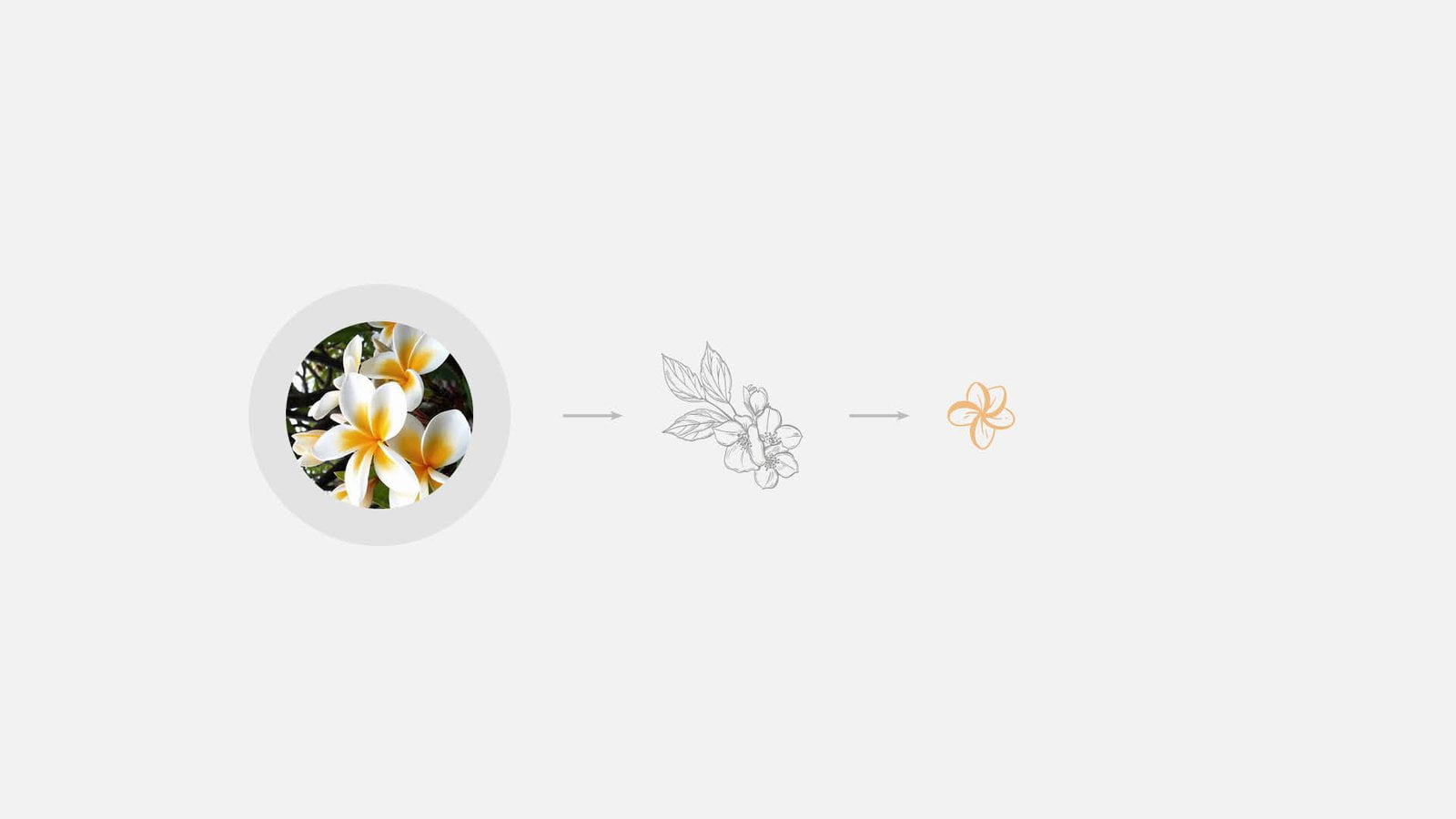
The symbol is a flower, chosen because it brings things together. It carries nature, purity, beauty, and scent, and passes them on to the brand.
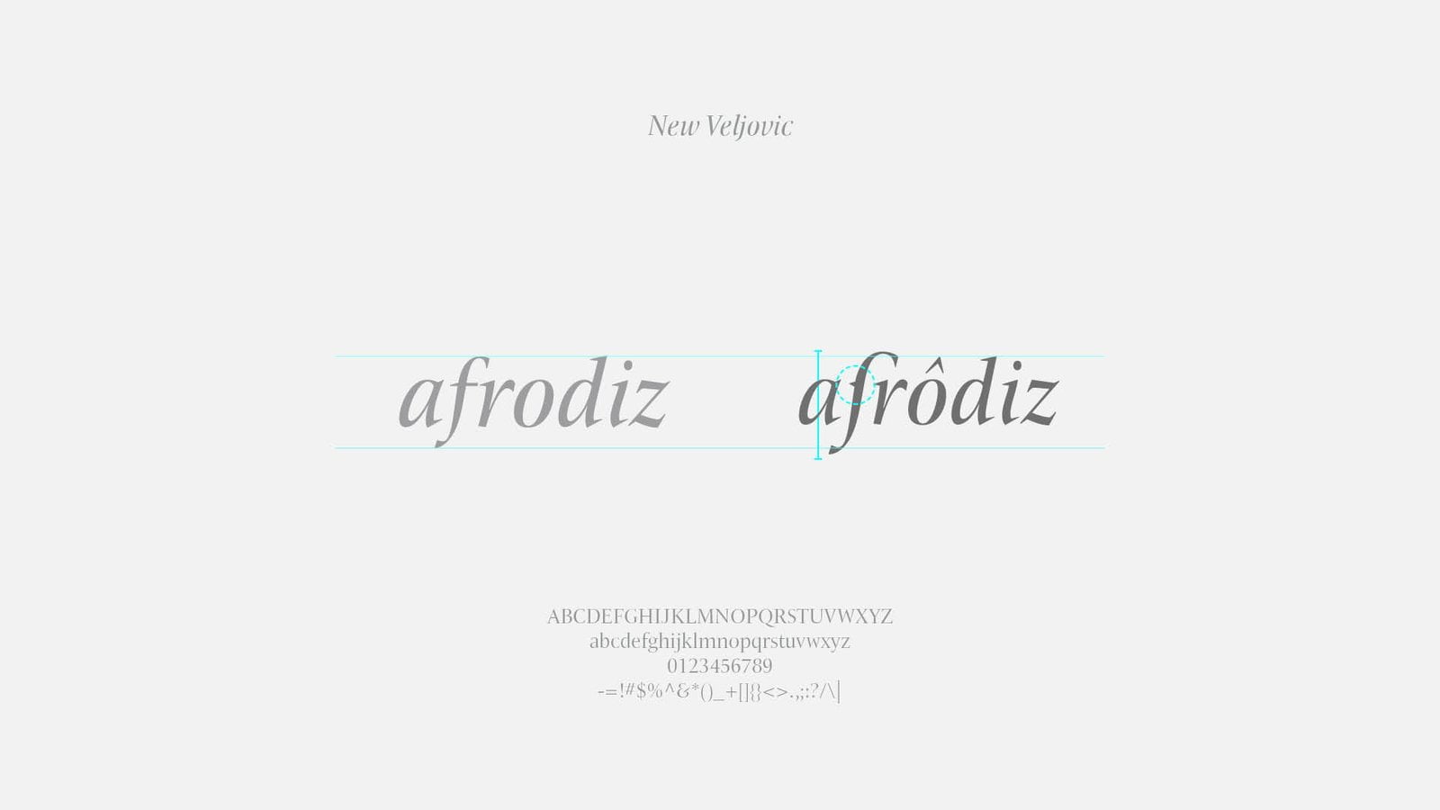
Logo construction over the lettering
From flower to drawing to symbol
Flower and color variations of the symbol
03

Applications

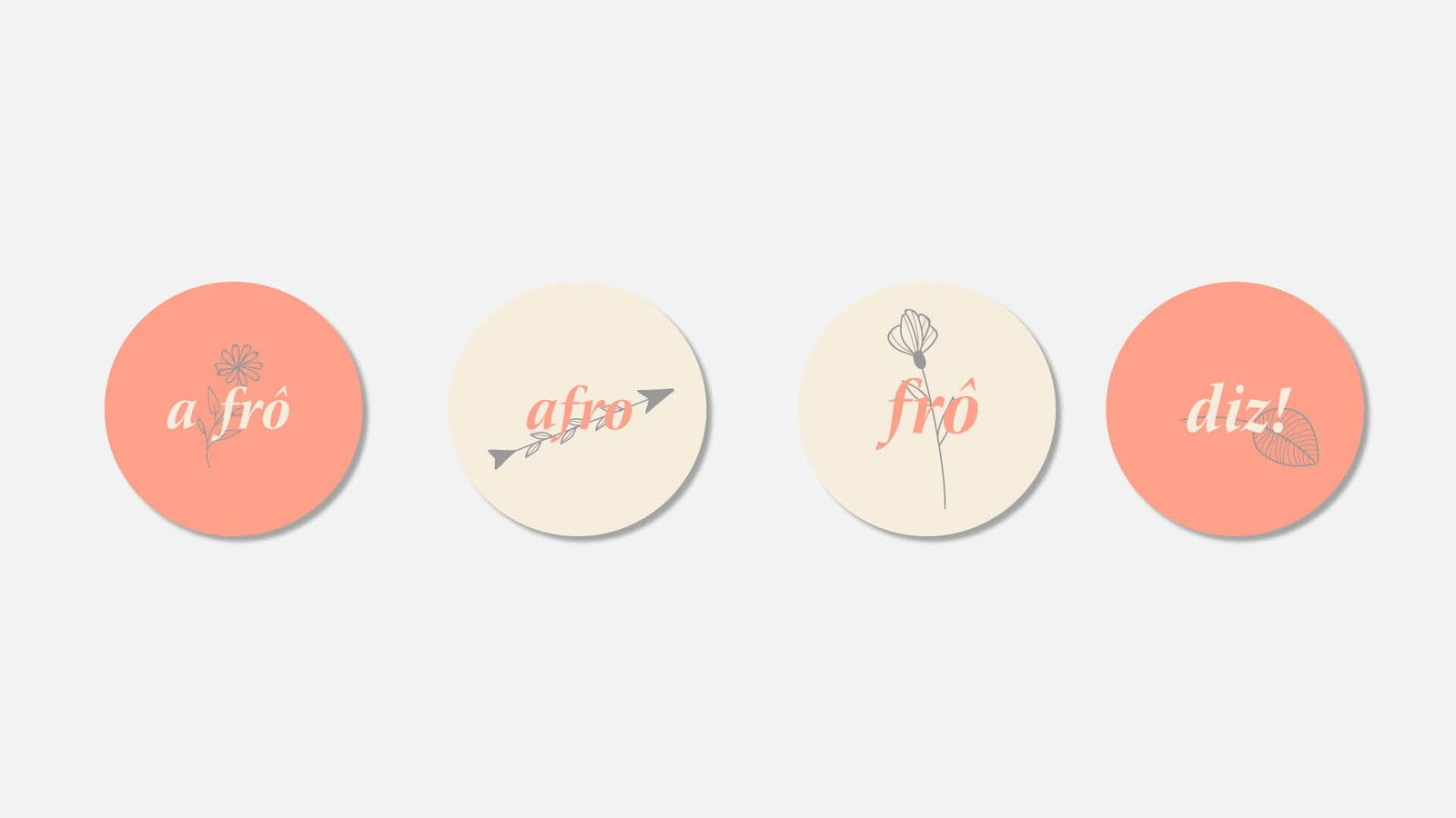
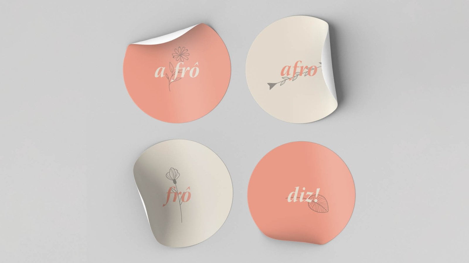
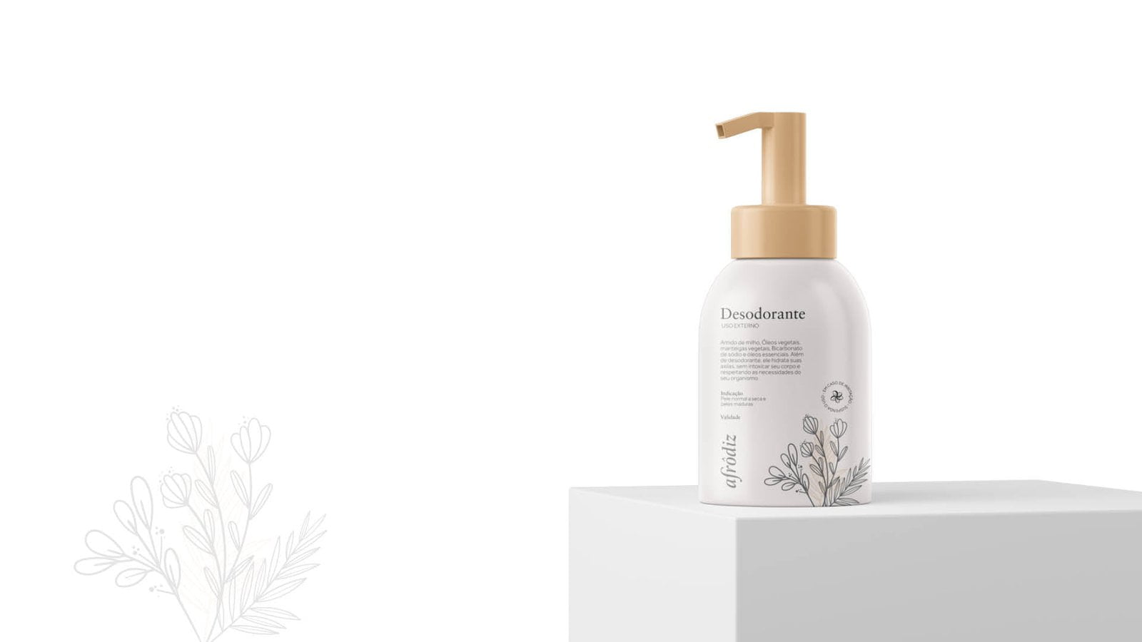
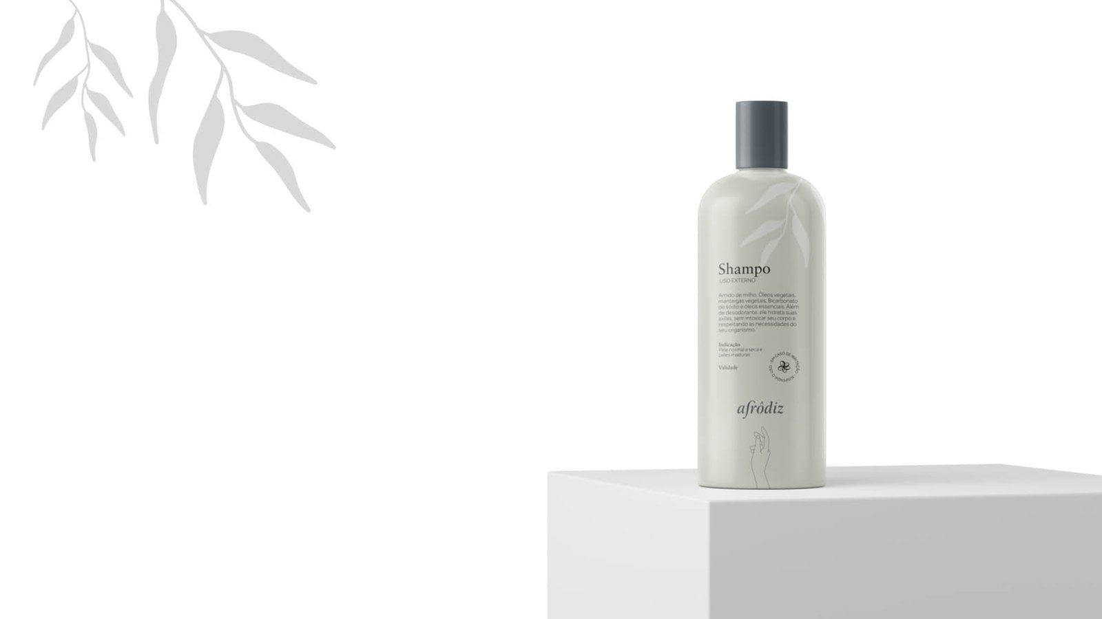
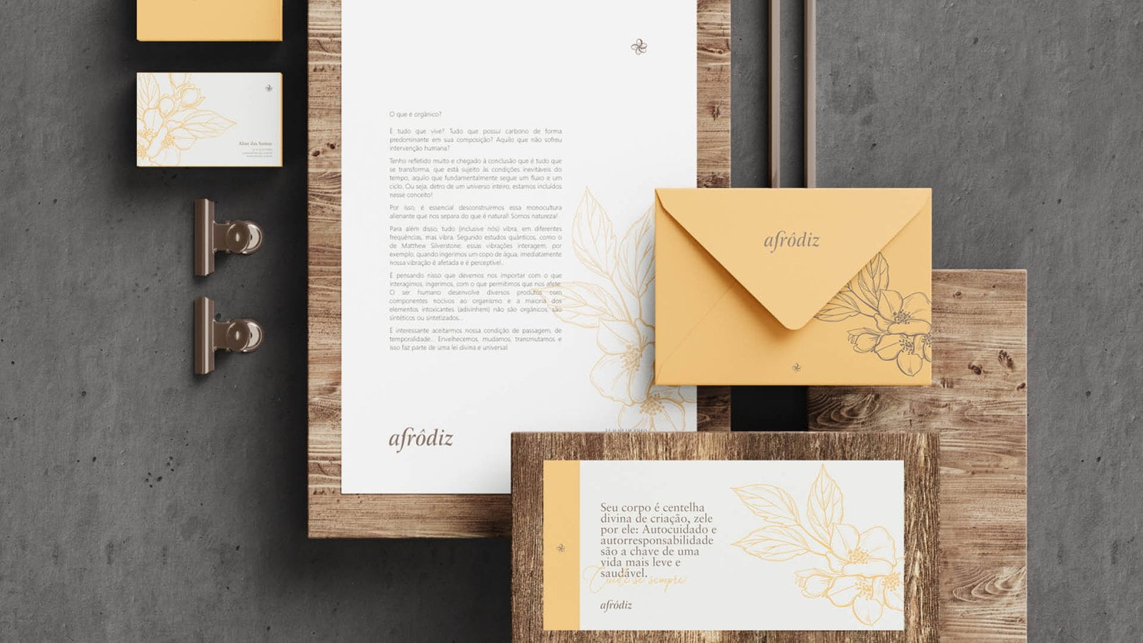
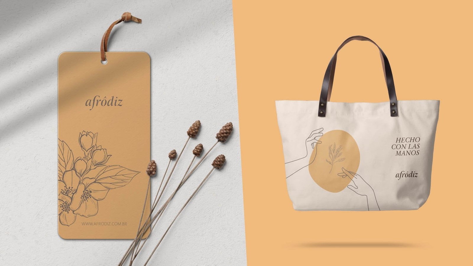
The identity extends to stickers, seals, packaging, and print materials.