Case · Product · 2023 — 2024

Bora Rachar

An app for splitting expenses and monthly bills with friends, coworkers, and family, so everyone knows who paid what.

Role
Product Designer & Design Team Lead
Period
September 2023 — October 2024
Deliverables
Research, journeys, information architecture, flows, and prototype
Tools
Figma · FigJam · Photoshop · Illustrator
Problem

Splitting bills with friends or family leads to forgotten payments and arguments. Nobody is sure who paid what.

Solution

A group expense-splitting app with payment tracking and notifications, designed from research.

Status

In development. I left after the design phase, which I took through to the prototype.

01

Context

Bora Rachar started as an app for splitting subscriptions and changed scope before it had a single screen.

The project ran at SouJunior Labs, a volunteer program for people changing careers who want hands-on experience with digital products. I led the Design team from research to prototype.

The app is still in development, so I only show selected parts here to protect the project’s intellectual property.

Bora Rachar screens
Bora Rachar screens

The original idea ran into the streaming services’ rules. We changed the scope before the first screen.

02

Scope and pain points

The first brief was a platform only for shared subscriptions: streaming, courses, software. In a session with the founders, the design team raised a problem. Companies in that space were restricting, and in some cases banning, account sharing. The idea would not hold up for long.

We proposed market research to check interest in a broader product for splitting expenses in general. The hypothesis held. The scope grew to cover rent, household bills, group trips, and other situations.

Friends, coworkers, and families split rent, subscriptions, and group bills every day without a tool that makes it clear. The app’s goal: show the whole group who has paid and what is still owed.

  • No organizationhard to split amounts accurately and keep track
  • No visibilitylittle clarity on who paid and what is pending
  • Poor communicationtalking about money is awkward and leads to disagreements
03

People

We built personas from qualitative research and from observing shared houses, couples, coworkers, and family groups. Each one covers a slice of the audience, with its own goals, pain points, and money habits.

With them, we mapped full journeys, from the moment someone needs to split a bill until the debt is settled. The journeys showed where friction appeared and helped us prioritize features.
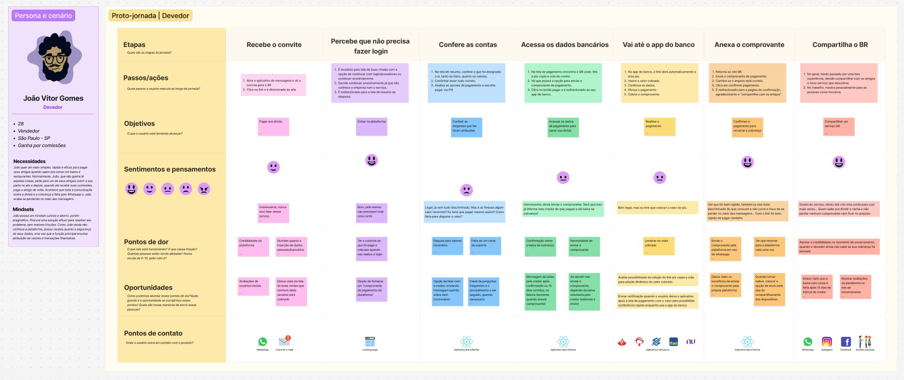
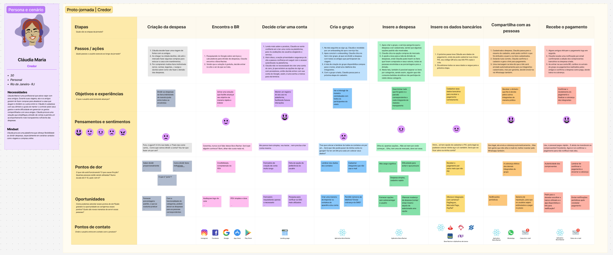
User journey, second persona
User journey: from needing to split a bill to settling the debt
04

Benchmark

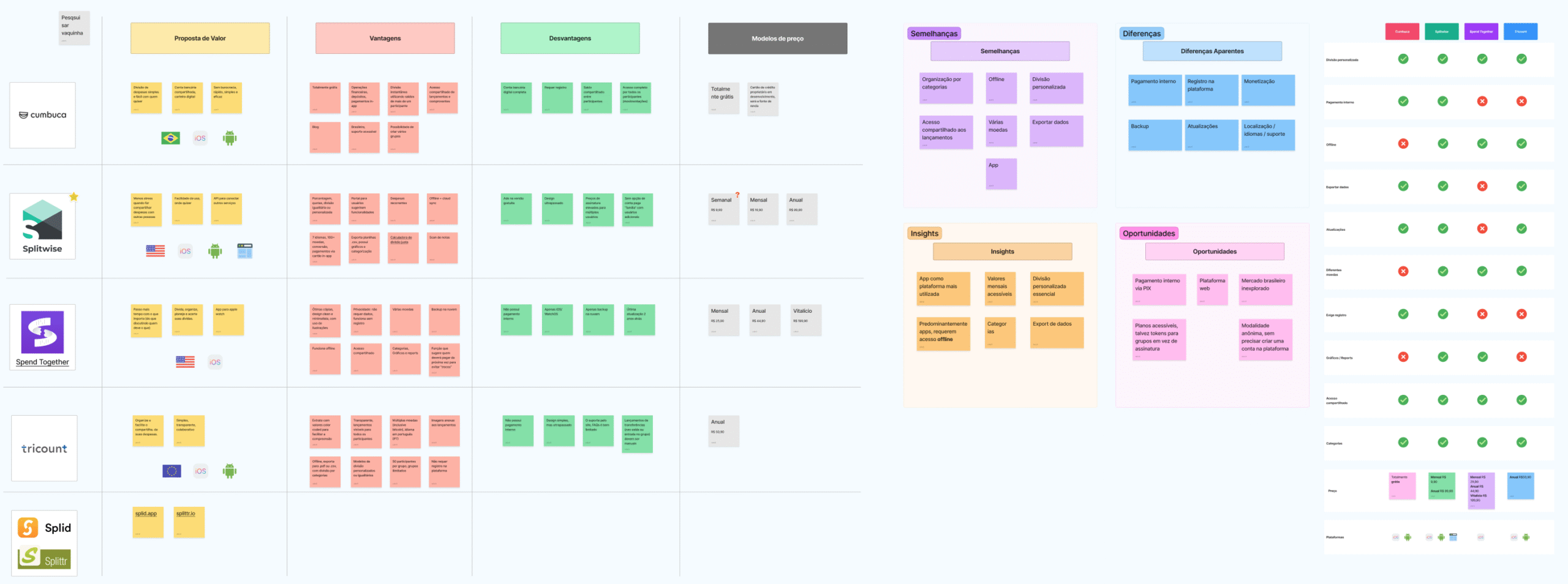
We analyzed Cumbuca, Splitwise, Spend Together, Tricount, and Splid, looking at business model, features, and usability. All of them split expenses, but several have confusing interfaces, little fit with how things work in Brazil, and limited support for recurring groups and monthly bills.

That gap became the positioning: a simpler product that matches how Brazilian groups handle money, from shared houses to families and couples.

Competitor analysis
Competitor analysis
05

Survey

We ran a survey on habits, difficulties, and expectations around splitting expenses. Most respondents split bills often but lack a reliable, easy-to-use tool. Automatic notifications, payment history, and transparency between participants came up as the most wanted features.

The data refined the value proposition and helped decide what went into the MVP.

Survey data analysis
06

Prioritization

We did the story mapping as a group. We mapped primary and secondary activities, from the first contact with the app to closing out a split. The map showed the critical MVP flows and the dependencies between features, and gave the whole team the same picture.

Seeing every story in one view made cutting easier: a lean first release that still gives users something useful.

Story map: from first sign-in to closing a split
07

Structure

With research and journeys in hand, we defined the information architecture. The sitemap set the screen hierarchy and the paths through the app, from sign-in to actions like creating groups and tracking expenses. Mapping screens and components planned for reuse and made alignment with development easier.

We drew user flows for each user type: people who create groups, people who only join splits, and people who manage several expenses. Each flow covers sign-up or login, joining groups, splitting an expense, tracking payments, and notifications.

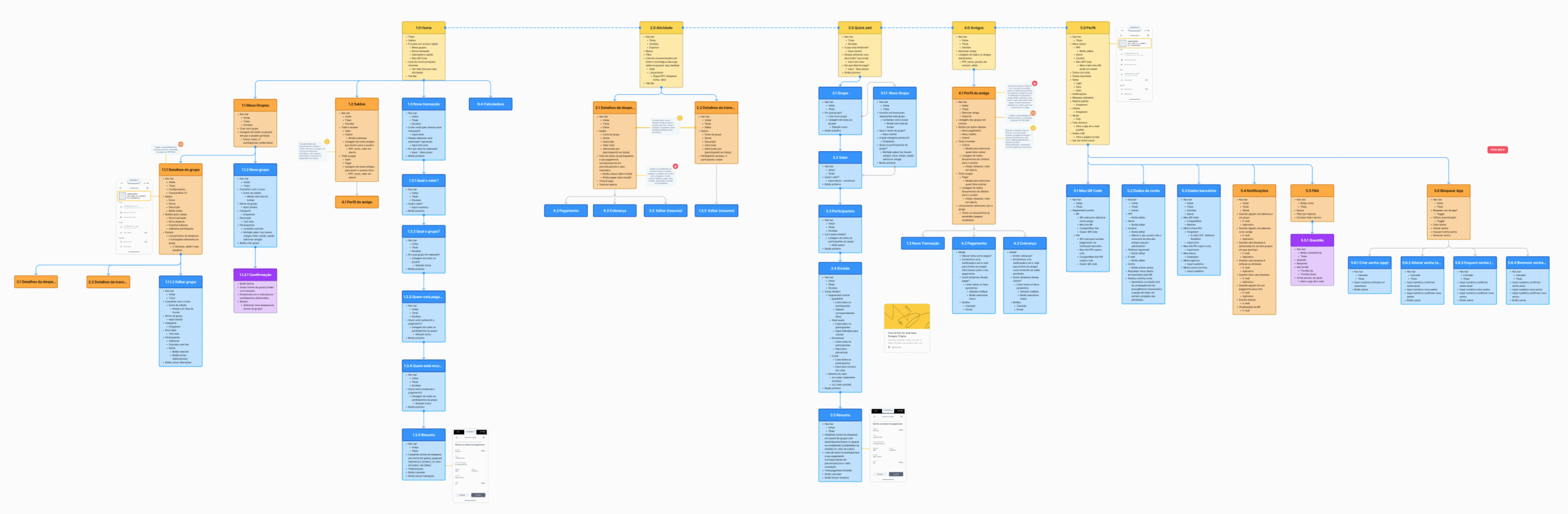
User flows by user type
Sitemap and screen and component map
08

Prototype

We sketched and iterated in low fidelity, then went straight to high fidelity. The goal was to save time and validate the concept with stakeholders and users. With a high-fidelity prototype, tests could simulate complete flows.

We also ran an unmoderated remote usability study in Brazil with 113 participants.

Prototype screens
Prototype screens
Prototype screens
Prototype screens
09

Accessibility

I built accessibility guidelines into the design from the start. Later phases of the project included dedicated accessibility tests.

  • Contrast and typereadable text and enough contrast for low vision
  • Touch targetsinteractive elements that are easy to hit
10

Where it stands

I left at the end of the design phase, and the team moved on to development.

The planned next steps were to finish the core features, test with real users, refine the interface based on feedback, launch, and plan integrations and premium tiers.

Bora Rachar screens
Bora Rachar screens