
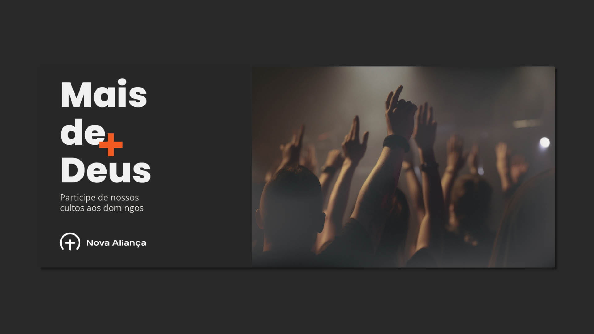
Visual identity and website for a Christian church, with a geometric symbol that brings together the covenant and the fire of the Holy Spirit.
Create an easy-to-recognize brand that communicates the church’s values and principles simply and directly.
Geometric shapes and color to represent God’s covenant with humanity and the fire of the Holy Spirit.
Visual identity, branding, and website delivered in 2024.
Igreja Nova Aliança (New Covenant Church) is a place of faith and fellowship. It offers Bible-based teaching and seeks to live by Judeo-Christian principles.
The brand had to be easy to recognize and convey those values plainly.

A simple, direct brand built on the idea of principles.
The concept starts from the idea of principles, a central theme in the Bible and in the Christian faith.
The identity uses geometric shapes and color to represent God’s covenant with humanity and the fire of the Holy Spirit.
The symbol combines a cross, a circle, and an arc, simple shapes that point to the covenant. It works on its own or next to the name, in horizontal and vertical versions.
The palette brings together olive green, black, white, cream, and an orange labeled “fire” on the color board. The typefaces are Hoves Pro and Poppins.


The identity was applied to stationery, posters, Instagram stories, and tithe and offering envelopes.


