Visual identity for Rastreye, a vehicle tracking and monitoring company that offers simple, straightforward services.
A tracking technology company needed a brand that conveyed precision while keeping the service easy to understand.
A name that joins rastreamento (Portuguese for tracking) and eye, with a modern typeface and a symbol built from the letter.
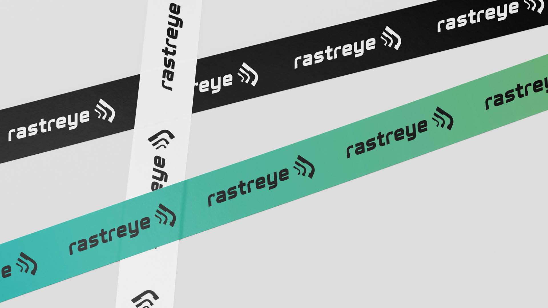
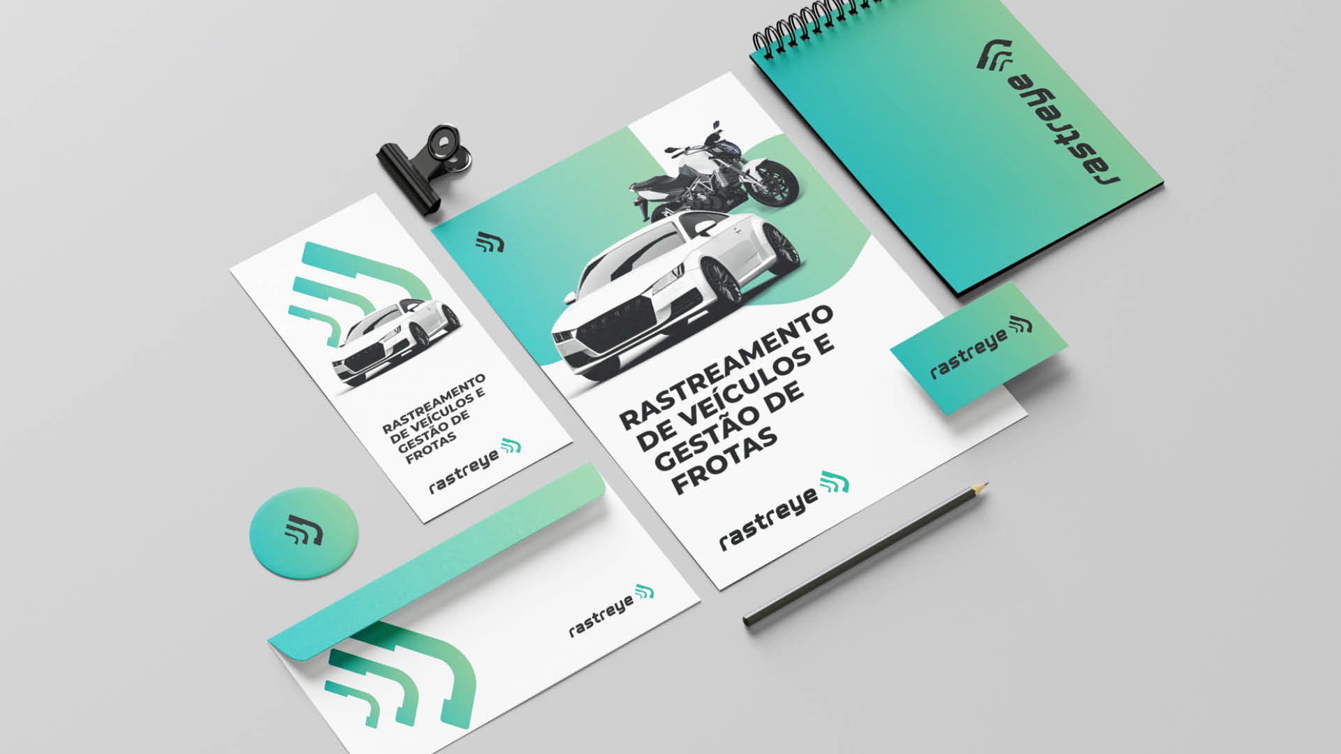
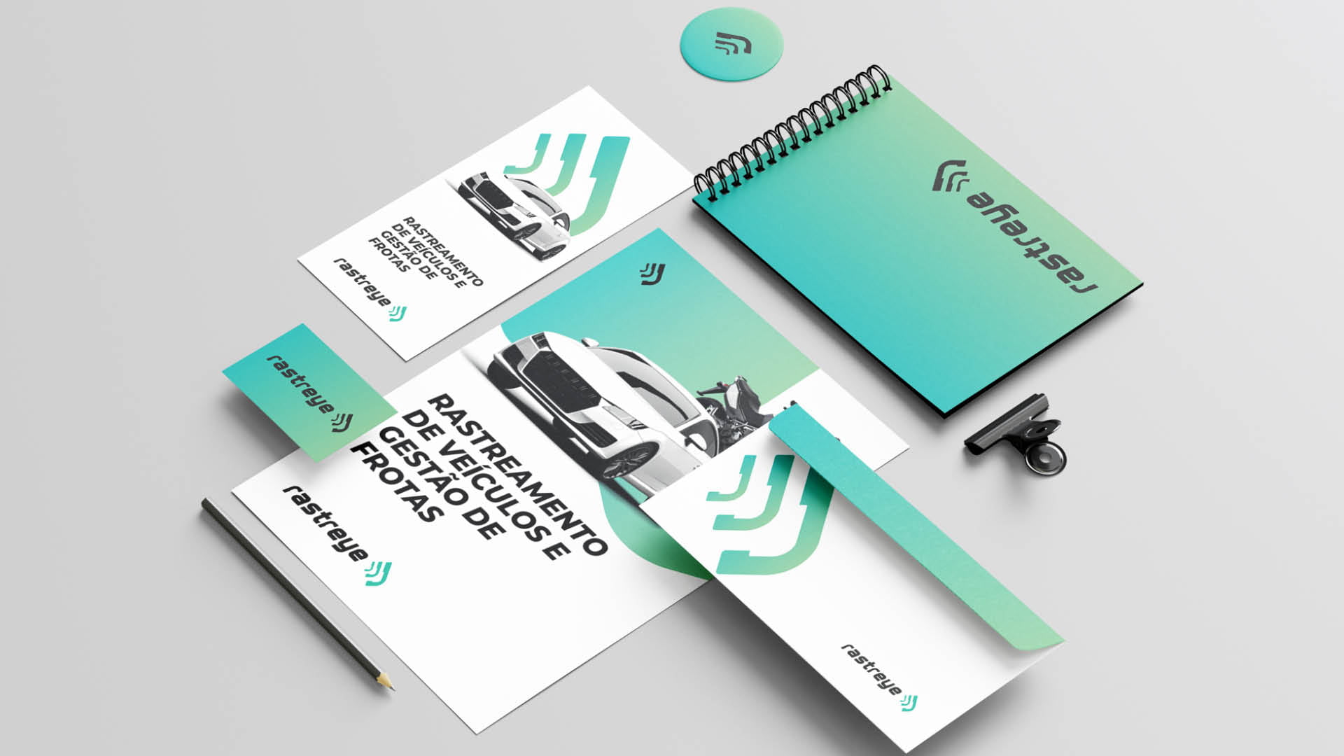
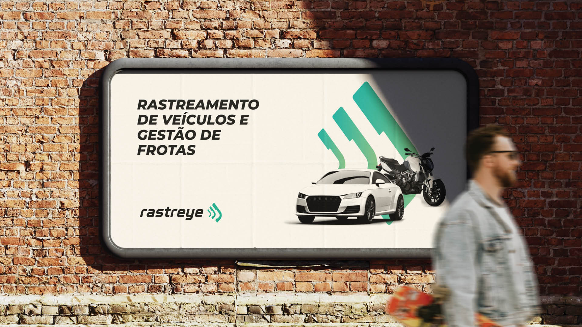
Visual identity delivered, with logo, color versions, and applications.
Rastreye sells monitoring intelligence to customers who want a well-defined, simple, and straightforward service.
The company tracks and monitors vehicles. The brand had to sound like technology and still read clearly.

Tracking and an eye in the same name.
The name joins rastreamento, Portuguese for tracking, and the English word eye. It is a visual shorthand for what the company does: keep an eye on things.
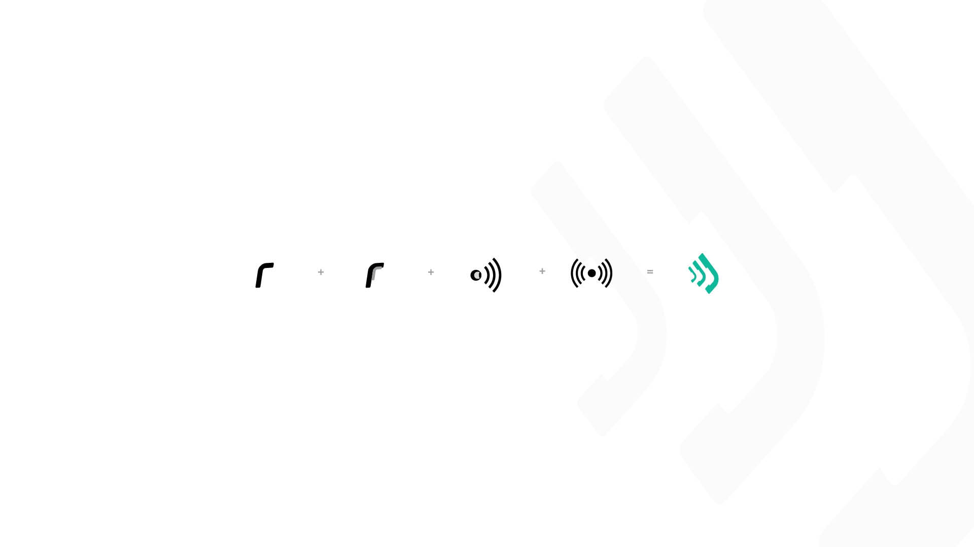
The typeface carries the modern, contemporary feel of technology. The symbol comes from the relationship between the type and the elements that make the business tangible.
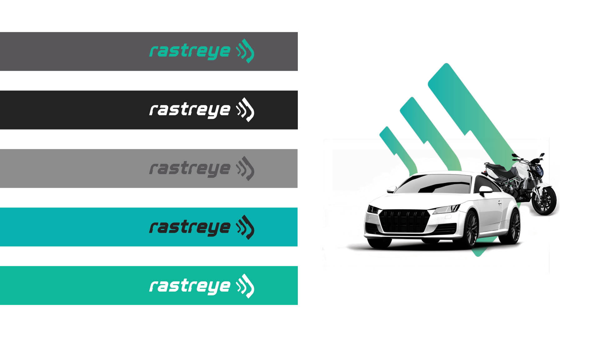
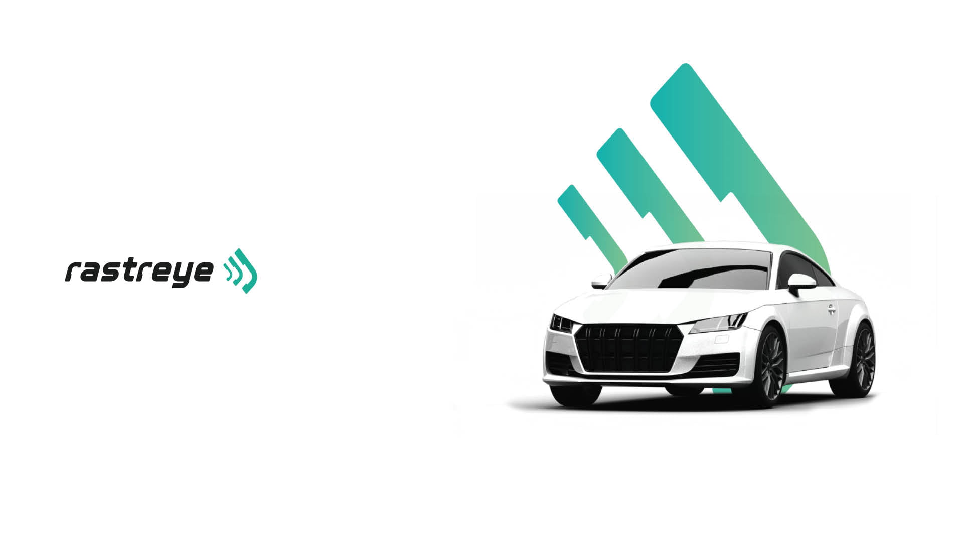
The brand was tested on light, dark, and colored backgrounds, then on stationery, tape, and an outdoor ad.