Visual identity and website for R&L Clean House, a professional cleaning company for homes and businesses in the Porto area of Portugal.
A new cleaning company wanted to feel approachable and modern at the same time, in both the residential and commercial markets.
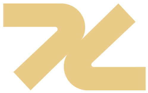
A symbol made from the partners’ initials, R and L, that also suggests a sparkle, and a simple geometric typeface.
Visual identity and website delivered.
R&L Clean House looks after family homes with loyalty and professionalism.
The company planned to offer professional cleaning for homes and businesses in the Porto area, and to refresh the market with modern techniques.
The brand’s focus is to feel approachable and modern at the same time.
Approachable and modern, and still simple.
The symbol combines the letters R and L, the founding partners’ initials. Joining them produced an icon that stands for cleanliness and shine.
The typeface is custom, with simple geometric shapes that are easy to recognize.
The brand was applied to stationery, marketing pieces, and the company website.