Case · Brand & website · 2022

Studio Hana

Visual identity and website for a design studio that sells simple, well-defined projects.

Client
Studio Hana
Role
Lead designer · Drapo Studio
Year
2022
Deliverables
Visual identity, branding, and website
Problem

Give a design studio a brand as simple as the projects it delivers.

Solution

A symbol drawn from the wind, in thick and thin curves, for a name that means grace.

Delivery

Visual identity, branding, and website delivered in 2022.

01

Context

Studio Hana is a design studio. It sets out to offer one-of-a-kind projects to clients who value well-defined, simple, and straightforward services.

The brand had to follow the same rule: minimal, easy to recognize and to remember.

Symbol on a dark background

A minimal brand that is easy to recognize and to remember.

02

Concept

Hana holds several meanings: flower, grace, happy, blessed.

The name carries the meaning “the gift of God’s grace,” along with “flower,” “happy,” “blessed,” and “graceful.” The symbol expresses that sense of gift and grace.

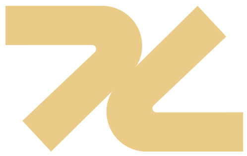
The symbol starts from the wind. The drawing uses thick and thin curves moving in different directions.

The palette is neutral: grays, black, and a sand tone. The typeface is Amelaryas.

From S and H to the symbol
Logo construction
Logo construction
Color palette
Color palette
Amelaryas typeface
Amelaryas typeface
03

Applications

The identity was applied to stationery, seals, and everyday items.